Wogibtswas App
Wogibtswas App
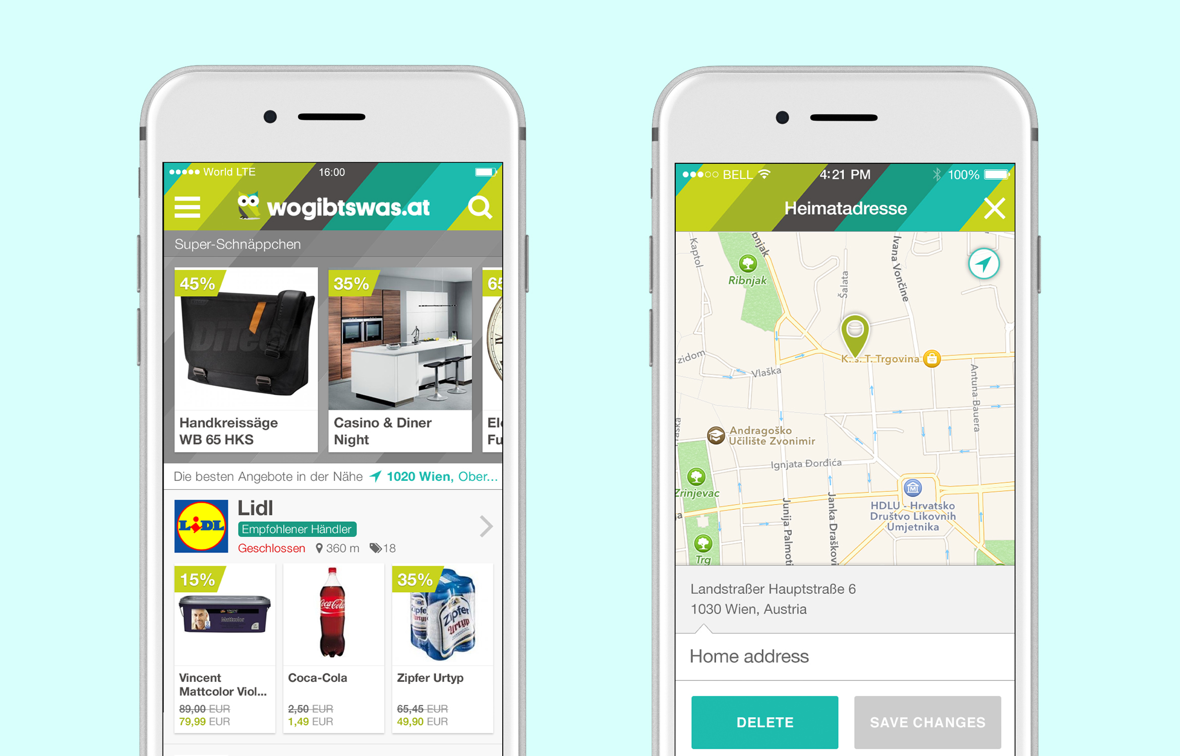
Wogibtswas.at is a popular website that shows all the best discounts in shops throughout Austria. The client wanted to reach more users and develop a personalised geolocation-driven user experience in the form of a mobile application for iOS and Android devices.
Wogibtswas app shows 65,000 active discounts with over 20,000 stores using the platform.
CLIENT
Wogibtswas GmbH
TYPE OF WORK
UI Design, UX Design, Prototyping, Project Management
OVERVIEW
OVERVIEW
Wogibtswas already had a very successful website where users could find a collection of discounts from the various shops, travel agencies, restaurants from all over Austria. Because mobile phones offered more reliable and advanced geolocation features, they decided to branch out their business model into the mobile application market by developing the mobile application that would show users discounts based on their current location and offer them some other features based on those discounts, i.e. a “buy now” option if that particular establishment has an online store.
PROJECT START
PROJECT START
I worked with the design agency Trikoder on this project and to start this project we had an initial sprint planning session with product owners from Wogibtswas. In this intense session we identified the problems that needed to be solved, defined the mission for the entire project, determined what the user needs and user personas were, and created storyboards and user flows for the entire project.
USERS & AUDIENCE
USERS & AUDIENCE
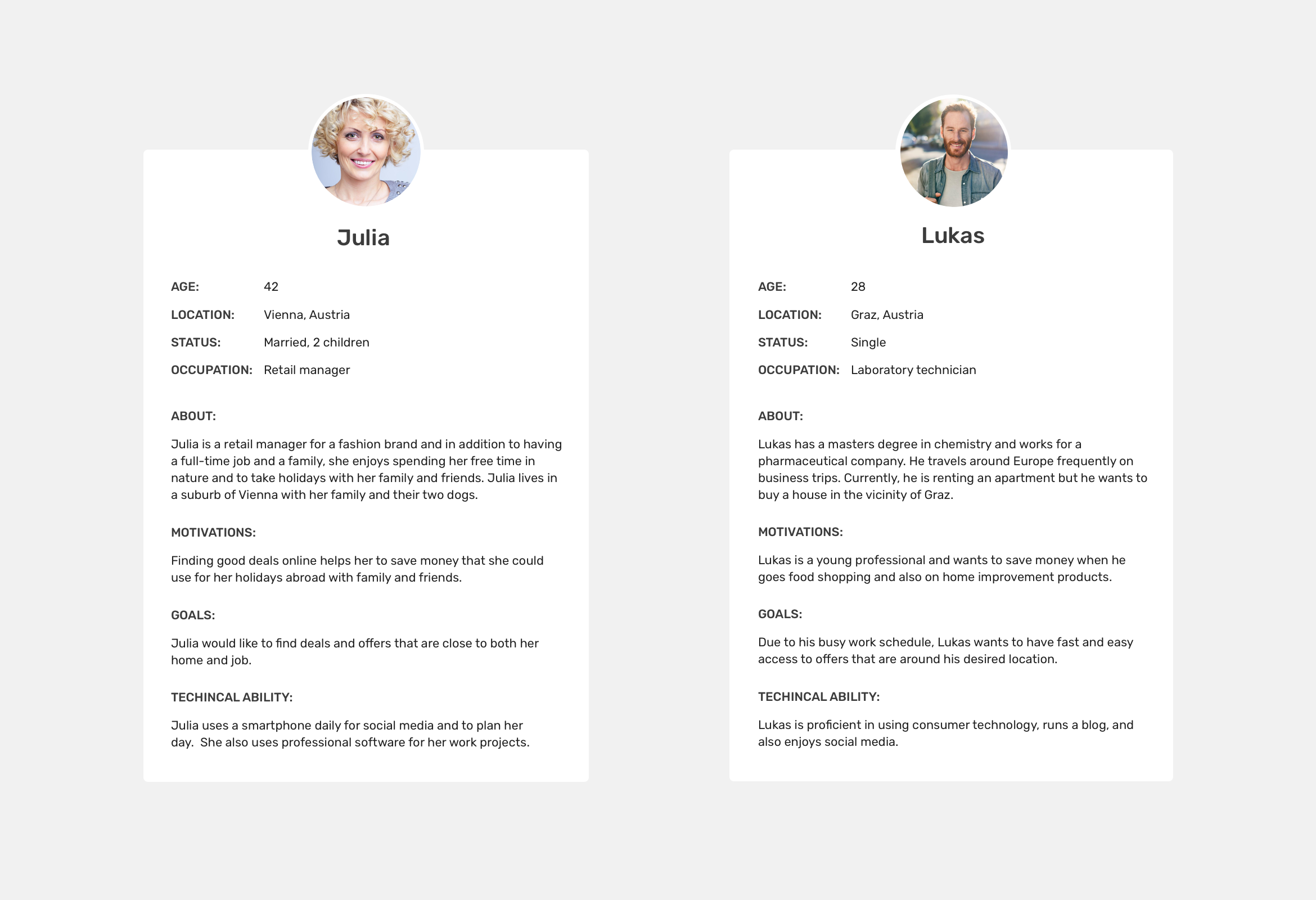
Wogibtswas, as a part of Styria Austria, had a well established user base with their web page. They did an in depth analysis of the user needs and came to the conclusion that a mobile app would be widely used. Two major types of users were identified in the process, as shown below.
AFFINITY DIAGRAMMING
AFFINITY DIAGRAMMING
In order to get in-depth analysis of the problems ahead, we used Affinity diagramming which helped to recognise main categories of the issues that we were facing. The areas that were defined after Affinity diagramming were:
- Geolocation
- Techical requirements
- Shop & Offers presentation
- Additional features
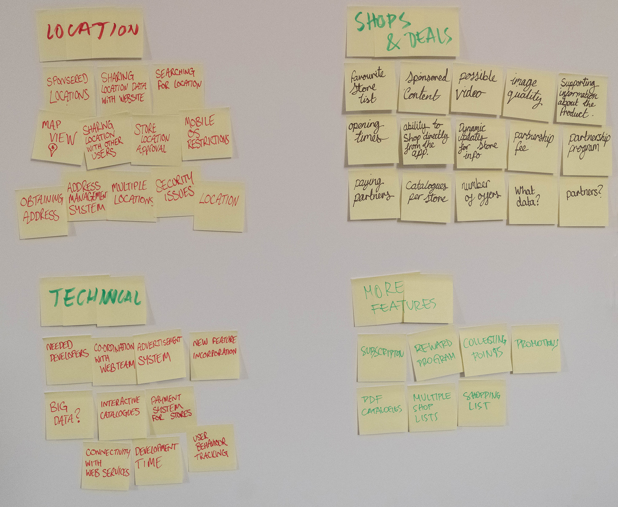
Affinity diagramming. Four main areas of interest.
BRAINSTORMING & STORYBOARDING
BRAINSTORMING & STORYBOARDING
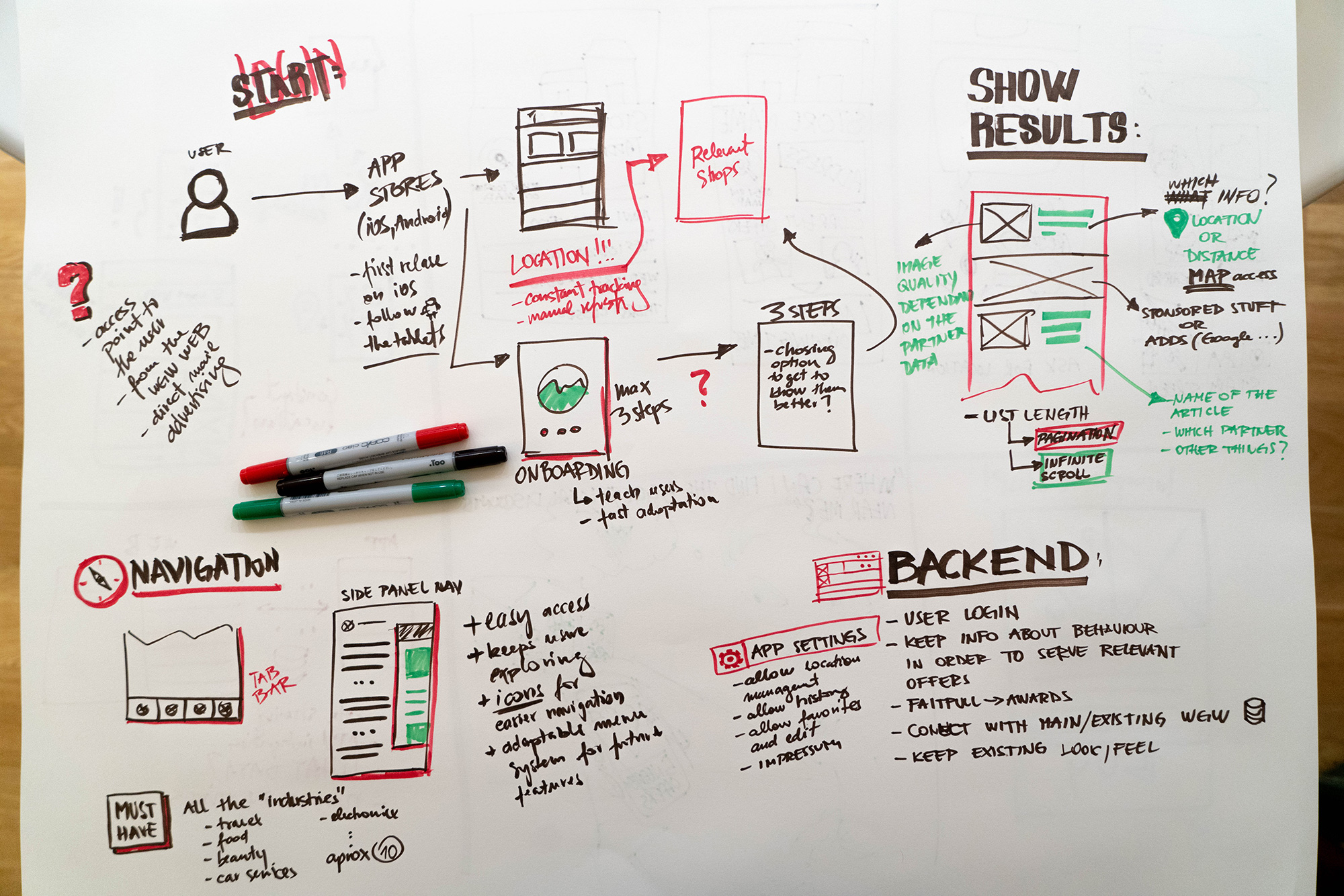
The main ideas from the affinity diagram were taken into account while we were brainstorming about the app functionality/design and we prioritised the features that would go in the first release of the app.
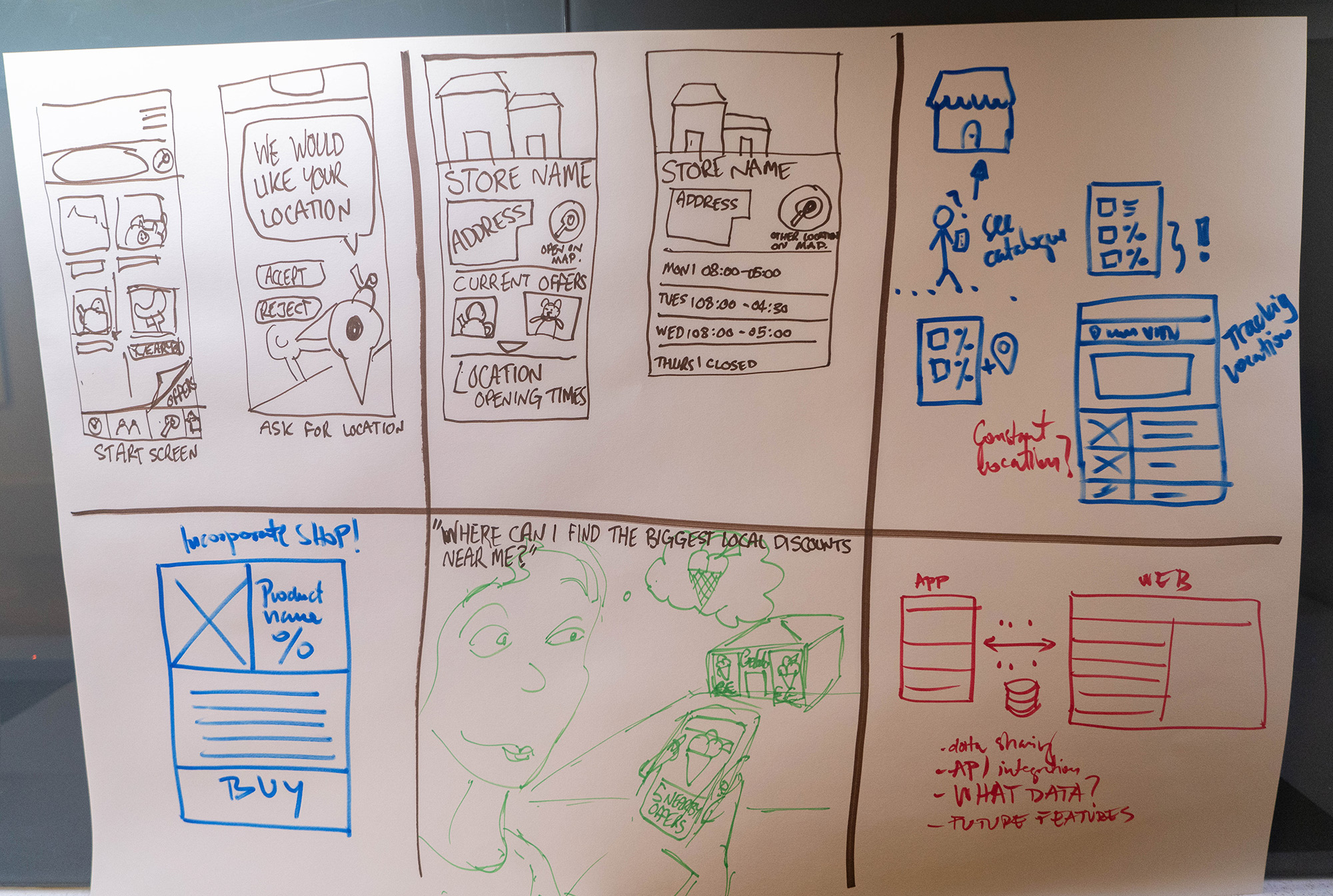
After prioritising the features, the participants of the session created several rough storyboard sketches in order to identify real life situations where the app would be used.
RATIONALE BEHIND THE SOLUTION
RATIONALE BEHING THE SOLUTION:
REQUIREMENTS:
- iOS & Android app (in the future tablet app)
- Integration with existing API
- User profile to understand user behaviour in the future
- Precise geolocation features
- Partner program
FEATURES:
- Location management system
- User profile that connects to existing website
- Light and easy user interface
- Ability to shop directly from the app
- All availabe details for the partner profile
USER FLOWS & WIREFRAMES
USER FLOWS & WIREFRAMES
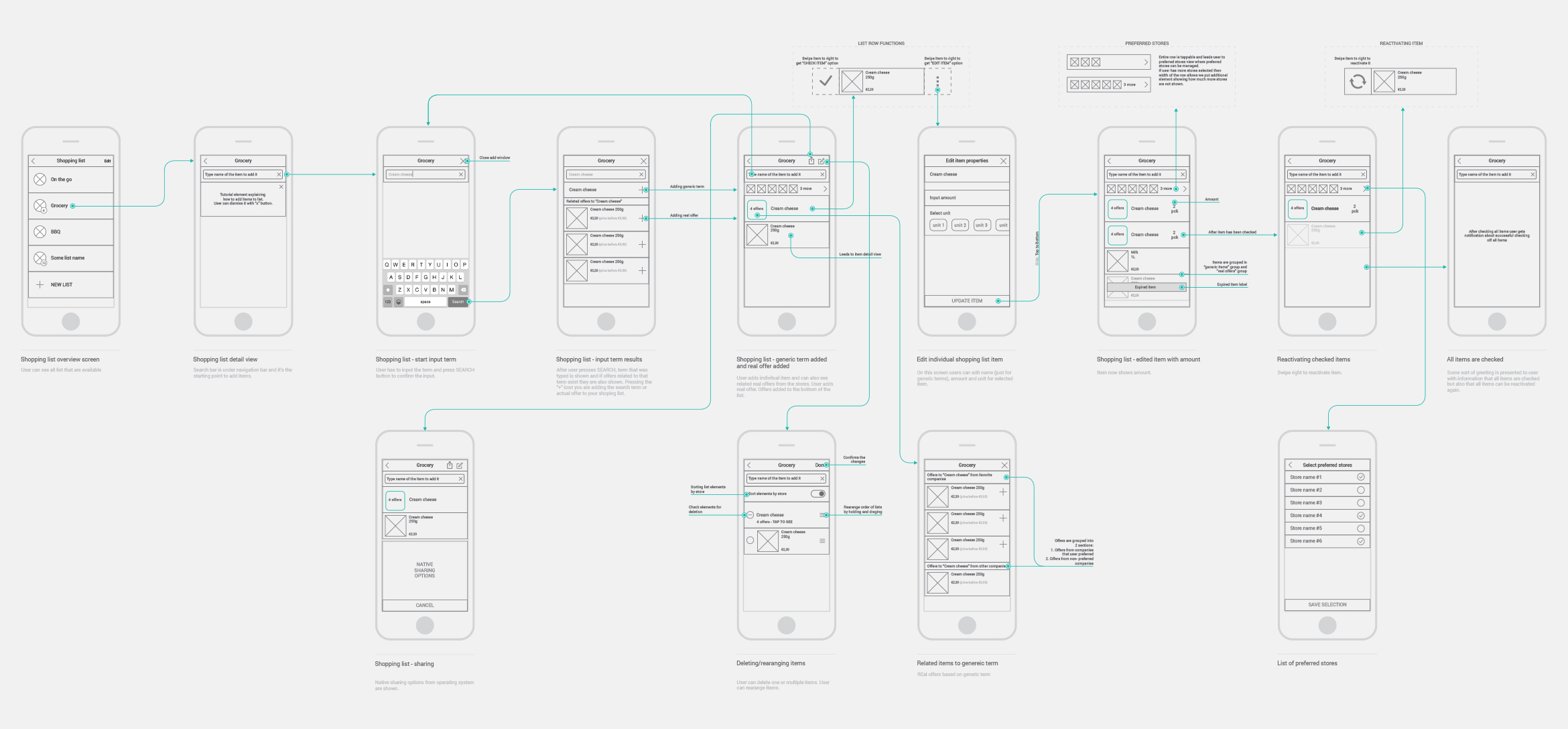
The design of the user interface began by defining the user journeys for each feature of the app. The user journeys were accompanied by wireframes. What resulted was a clearer view on how the user will navigate through the app and the wireframes served as a basis for designing the final screens.
I developed a set of assets for Adobe Illustrator that I used to make the wireframes and user journeys. These assets resulted in a more efficient work flow and I could easily make changes on the go.
FINAL DESIGNS
FINAL DESIGNS
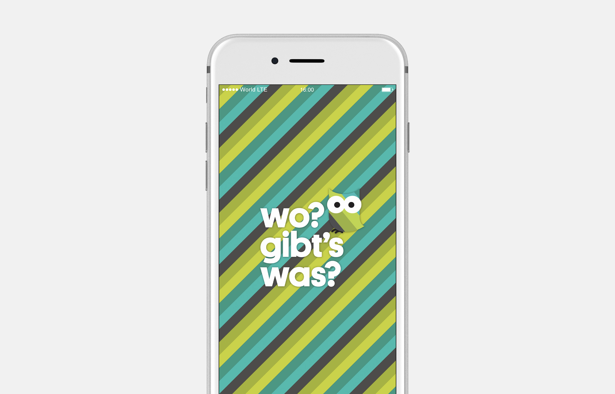
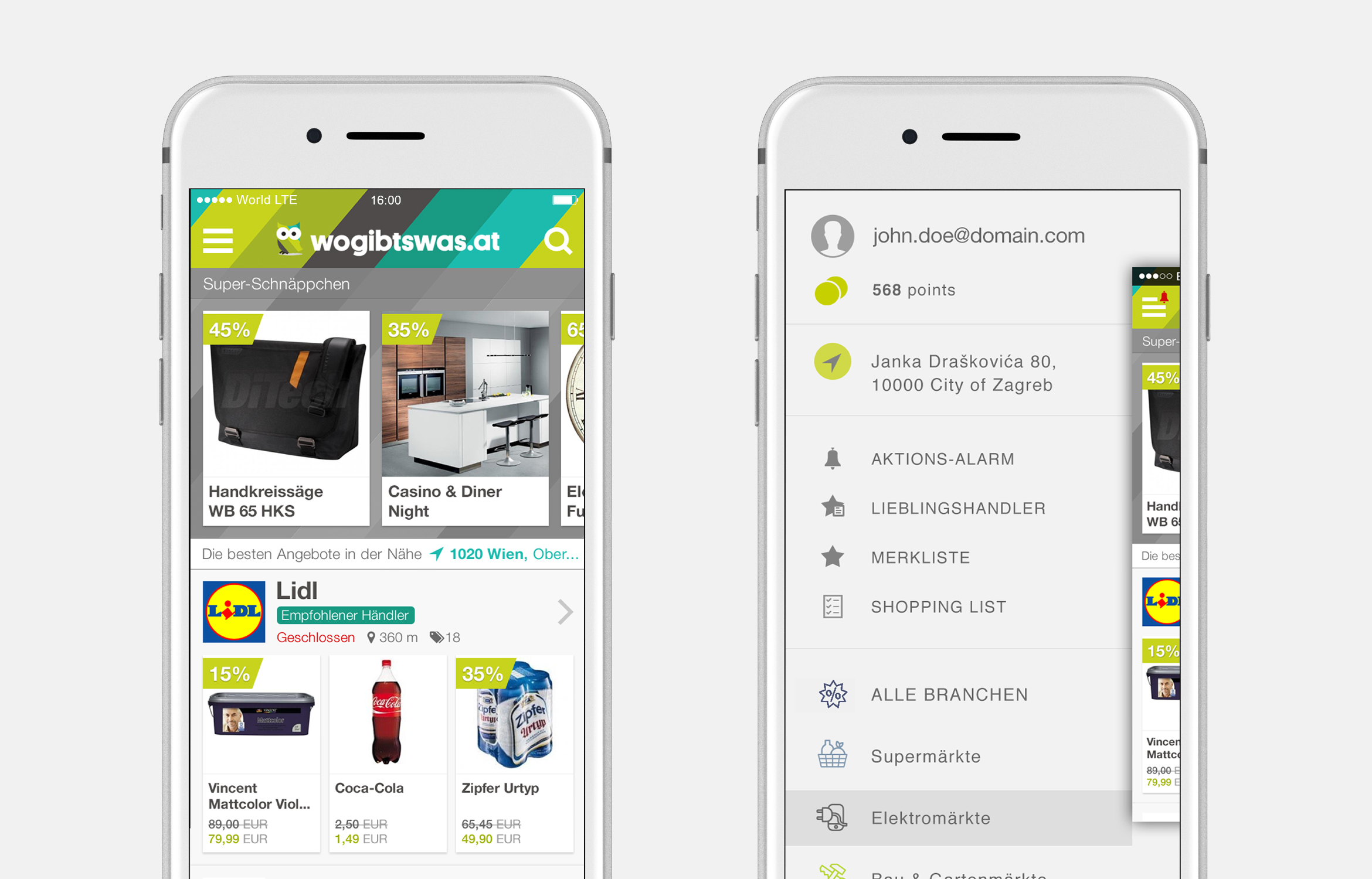
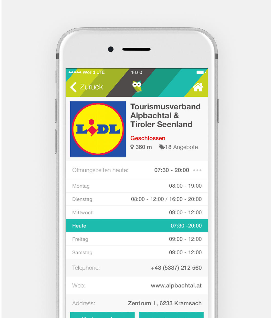
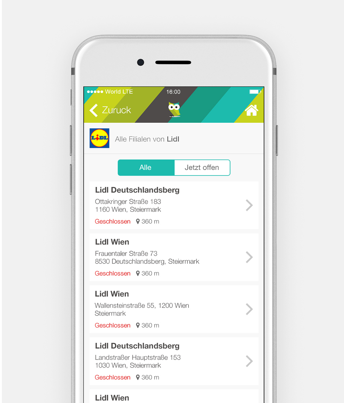
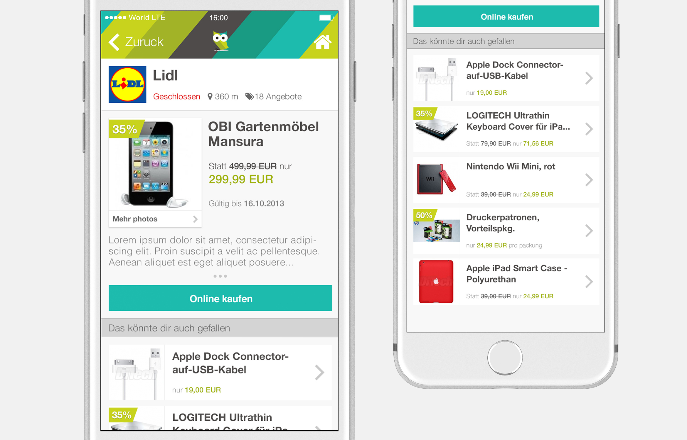
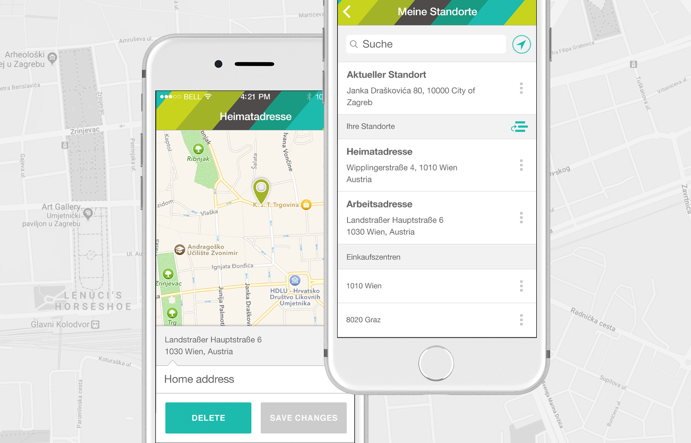
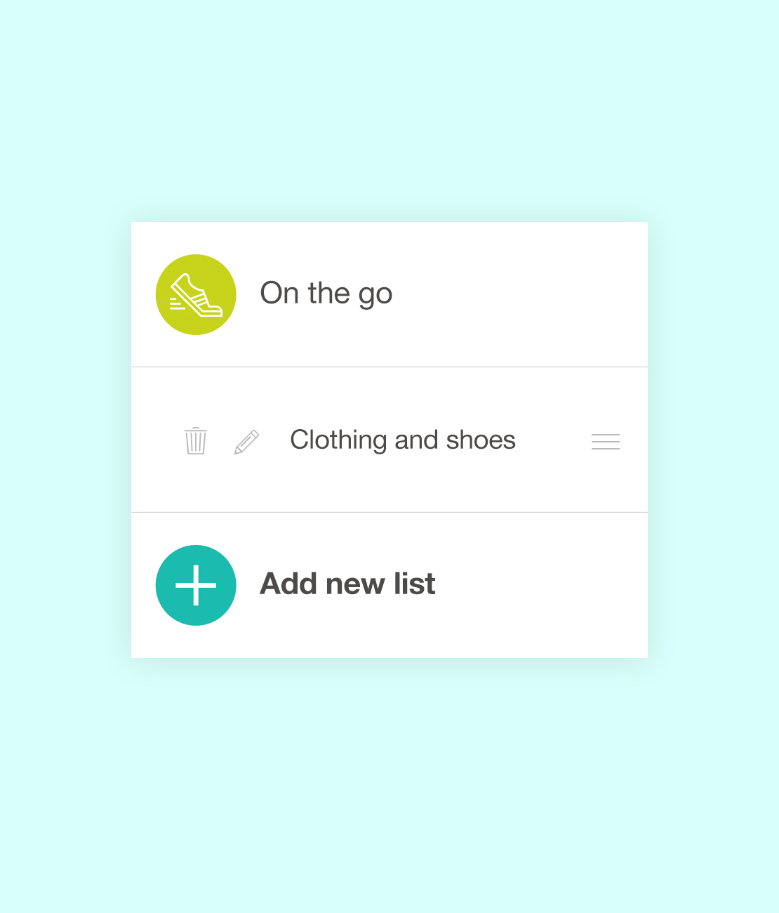
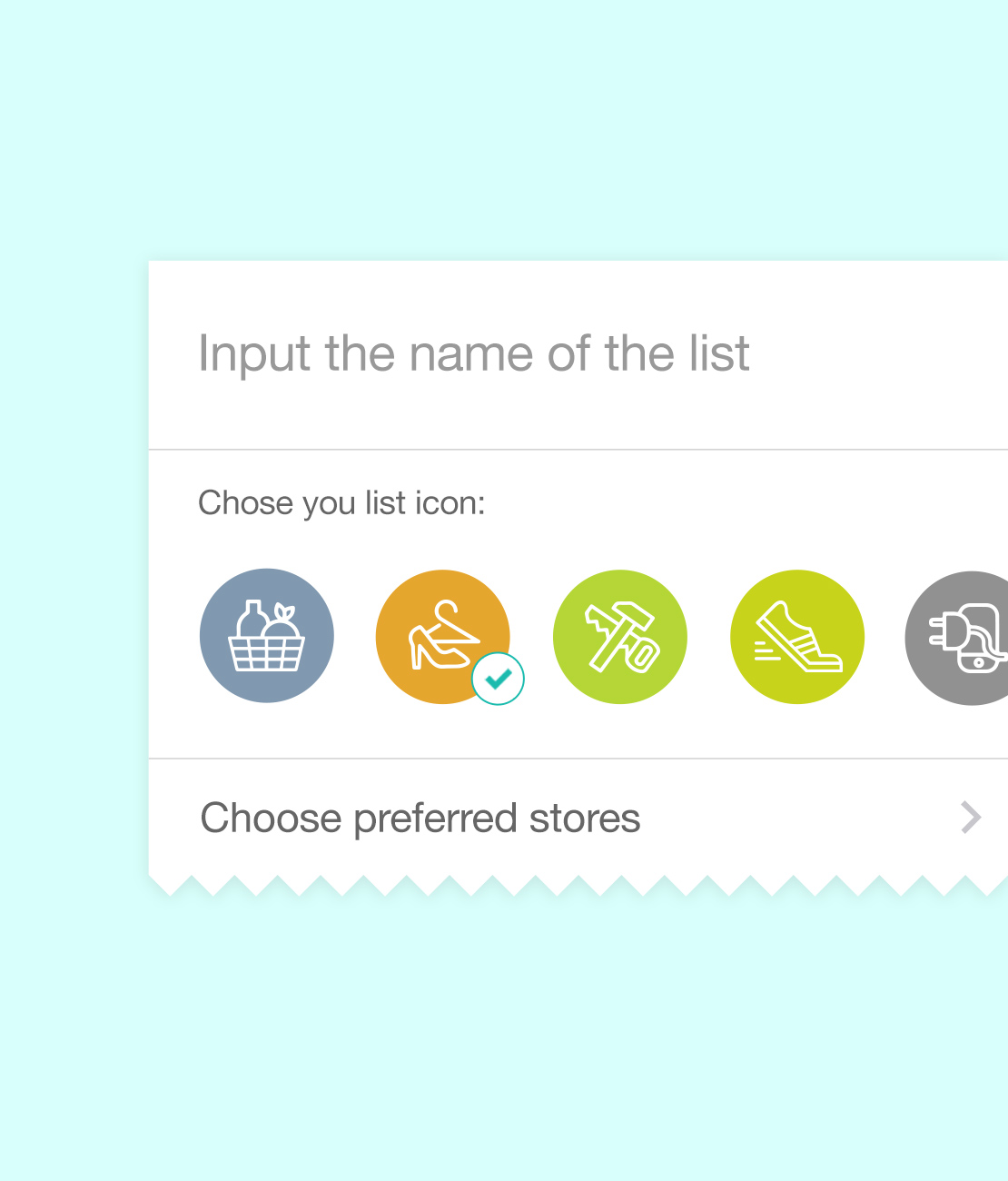
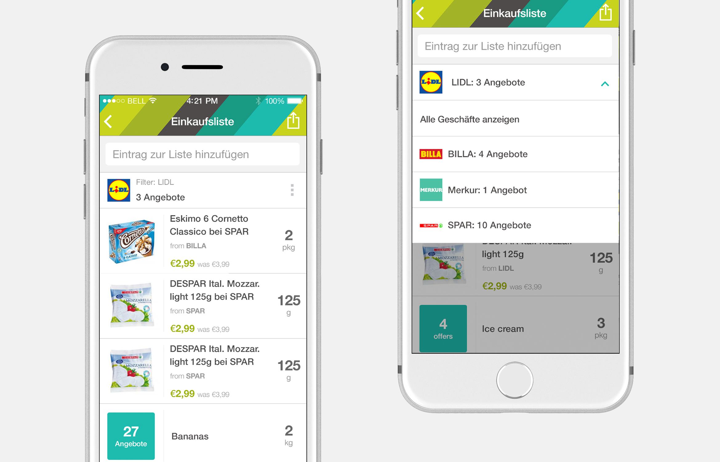
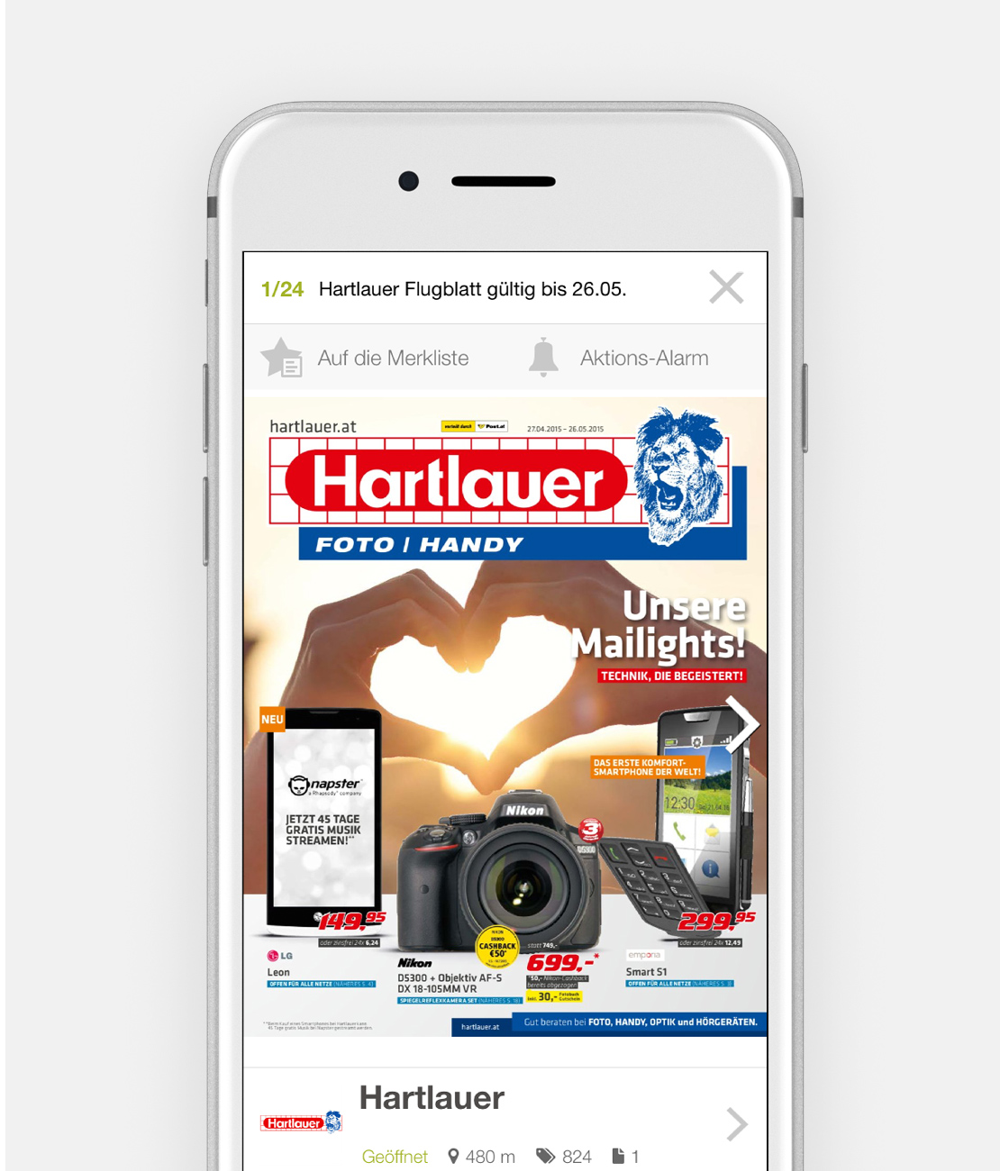
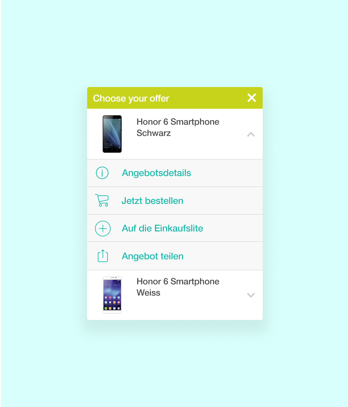
Designing the final app screens started by analysing the brand and all of its characteristics. After the app screens were designed, I had the task of extracting all of the app elements into a separate document and forming a Design system for the app. Because the client was planning on regularly introducing new features, having the Design system seemed like a move in the right direction in order to minimise the production time and to be more effective in the future by delivering a fast solution that can be easily and effectively tested and deployed.
FUTURE DEVELOPMENT
FUTURE DEVELOPMENT
After the first release of the app was completed, we continued to work on the app continuously through agile methodology. Each sprint was a 2-week process in which all the team members (the designer, 3 developers and the product owner) decided which feature should be developed and tested. Each sprint had a dedicated amount time allotted for design, development and testing.
Testing was usually done in the form of prototypes that were given to random people, the result of which was gaining insight on app usage. Because the backend system was set up in such a way that users’ habits could be tracked, we gleaned a lot of valuable information which was subsequently analysed and that resulted in us being able to improve on the app.
Get in touch! info@sabolism.com
