Protec Website & Online Store
Protec Website & Online Store
Protec Website & Online Store
Protec Website & Online Store
Protec is The UK's leading manufacturer & supplier of temporary protection materials. This project consisted of redesigning the home page and designing a new, simplified shopping experience.
CLIENT
Protec
TYPE OF WORK
UI Design, UX Design
DESIGN PROCESS
DESIGN PROCESS
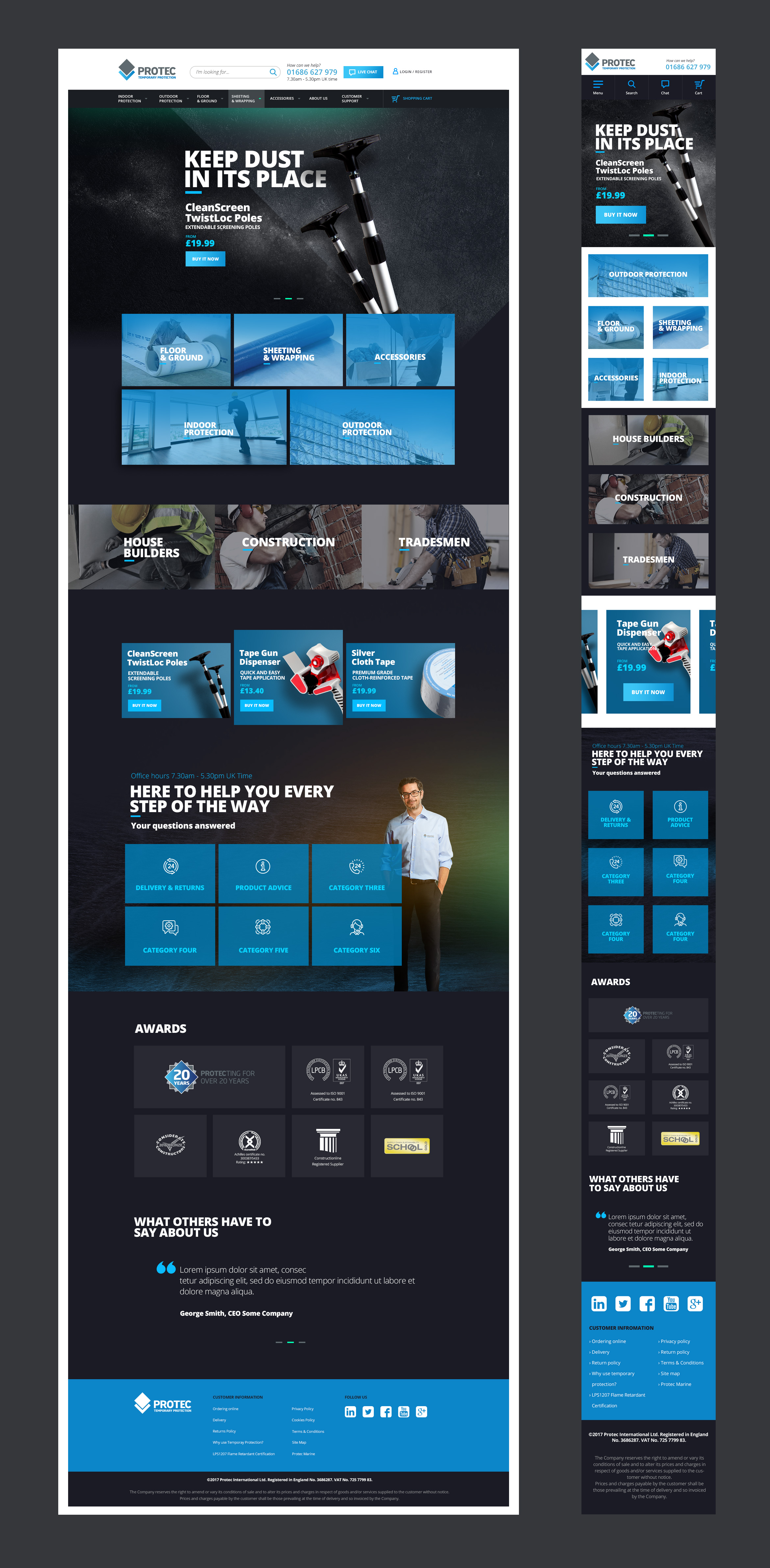
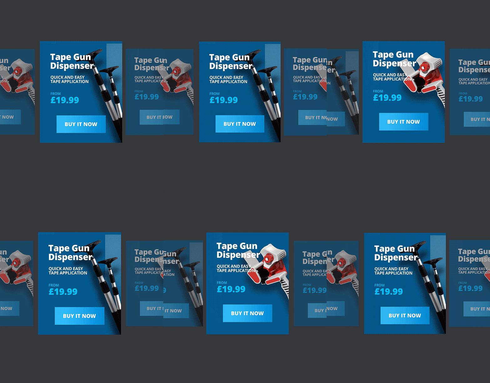
The idea behind the home page was the client’s request to have bolder colours and some texture. Because Protec is selling protection material, which is widely used in construction, I decided on a concrete pattern to be the foundation for the hero image slider where all the relevant new products would be advertised.
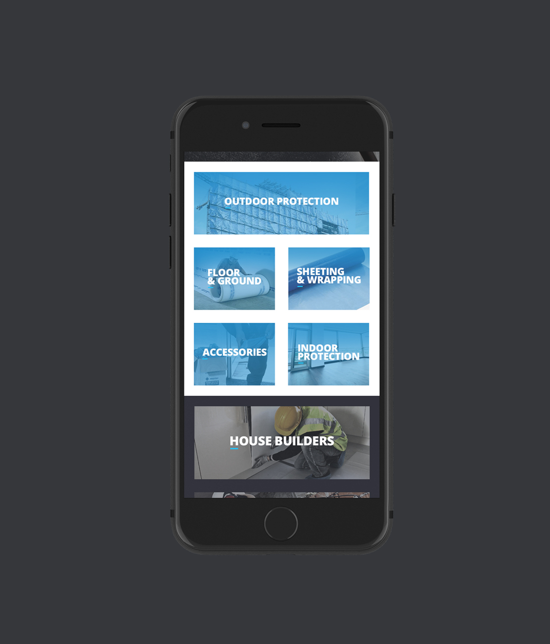
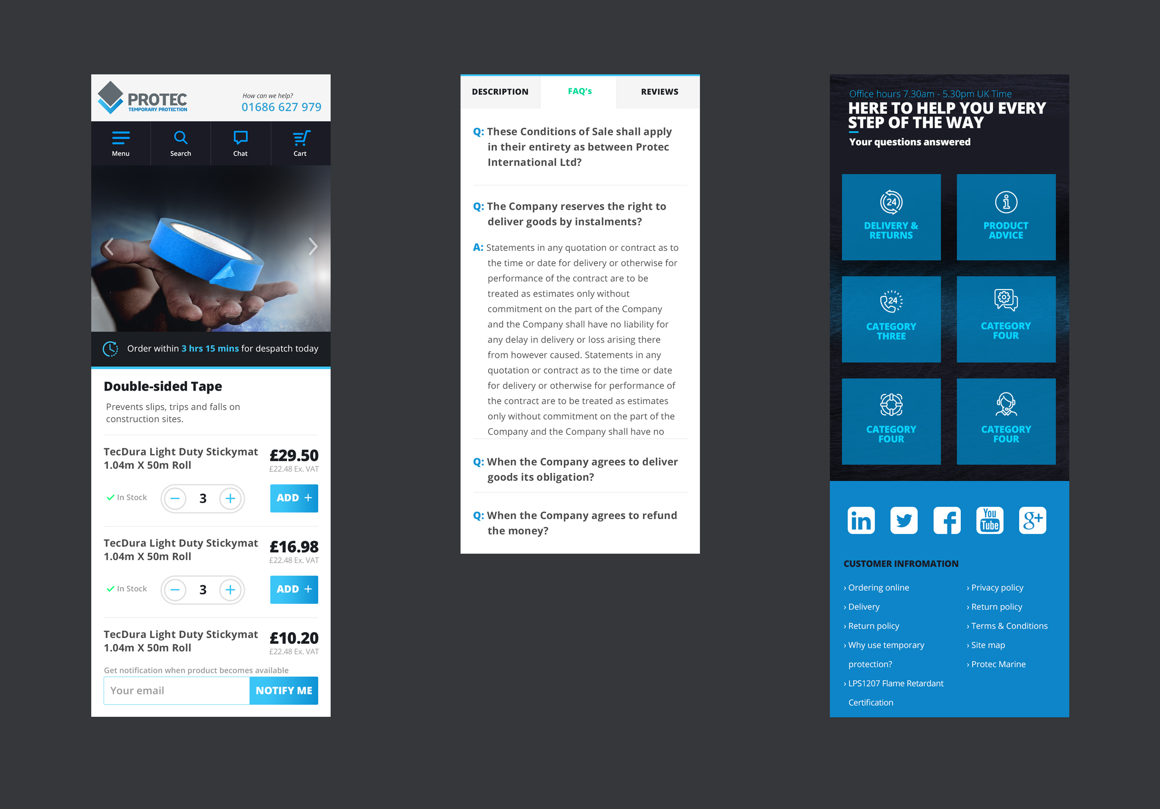
Bearing in mind that the page would be used by contractors while on the job, I wanted to make the mobile page as easy to use as possible. I achieved that by using big navigating blocks that are easy to differentiate from easy other and easy to tap.
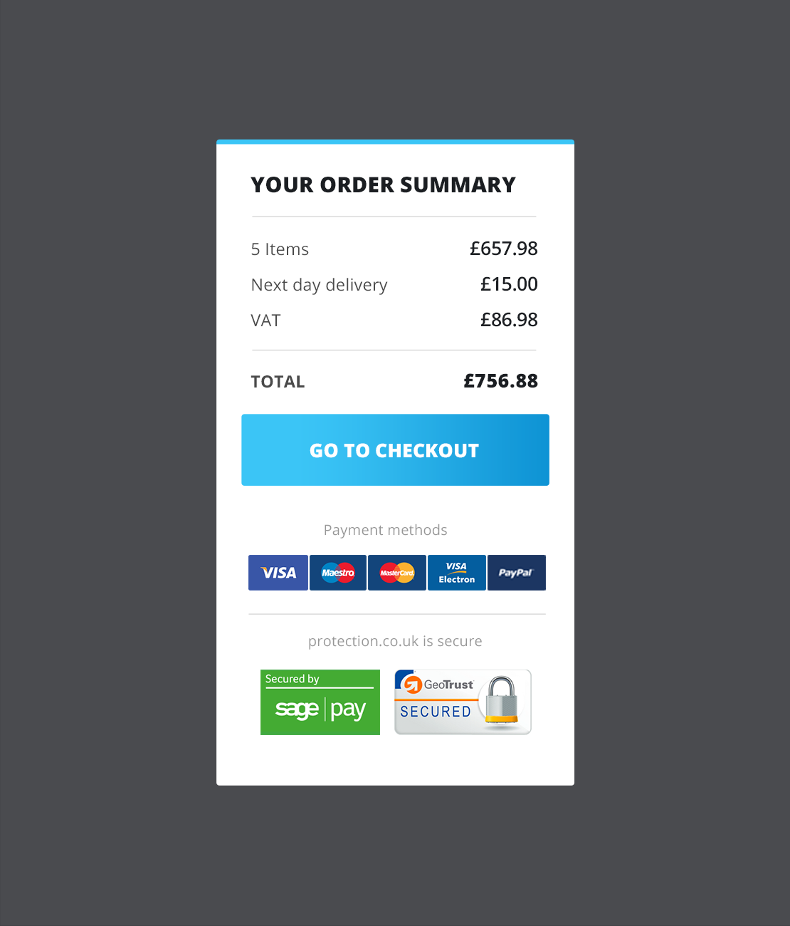
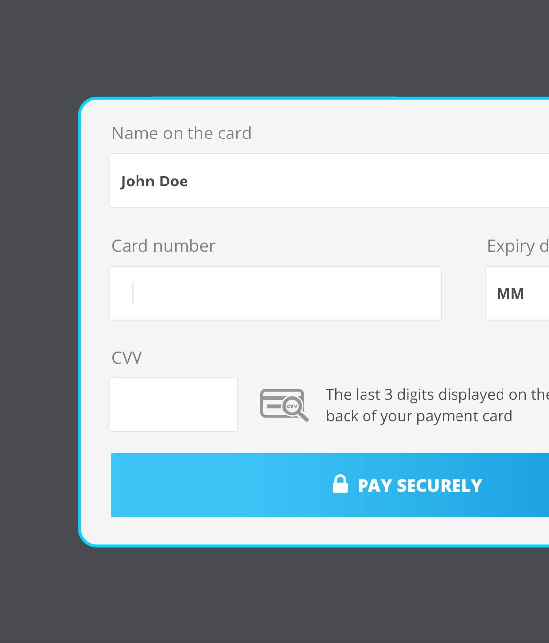
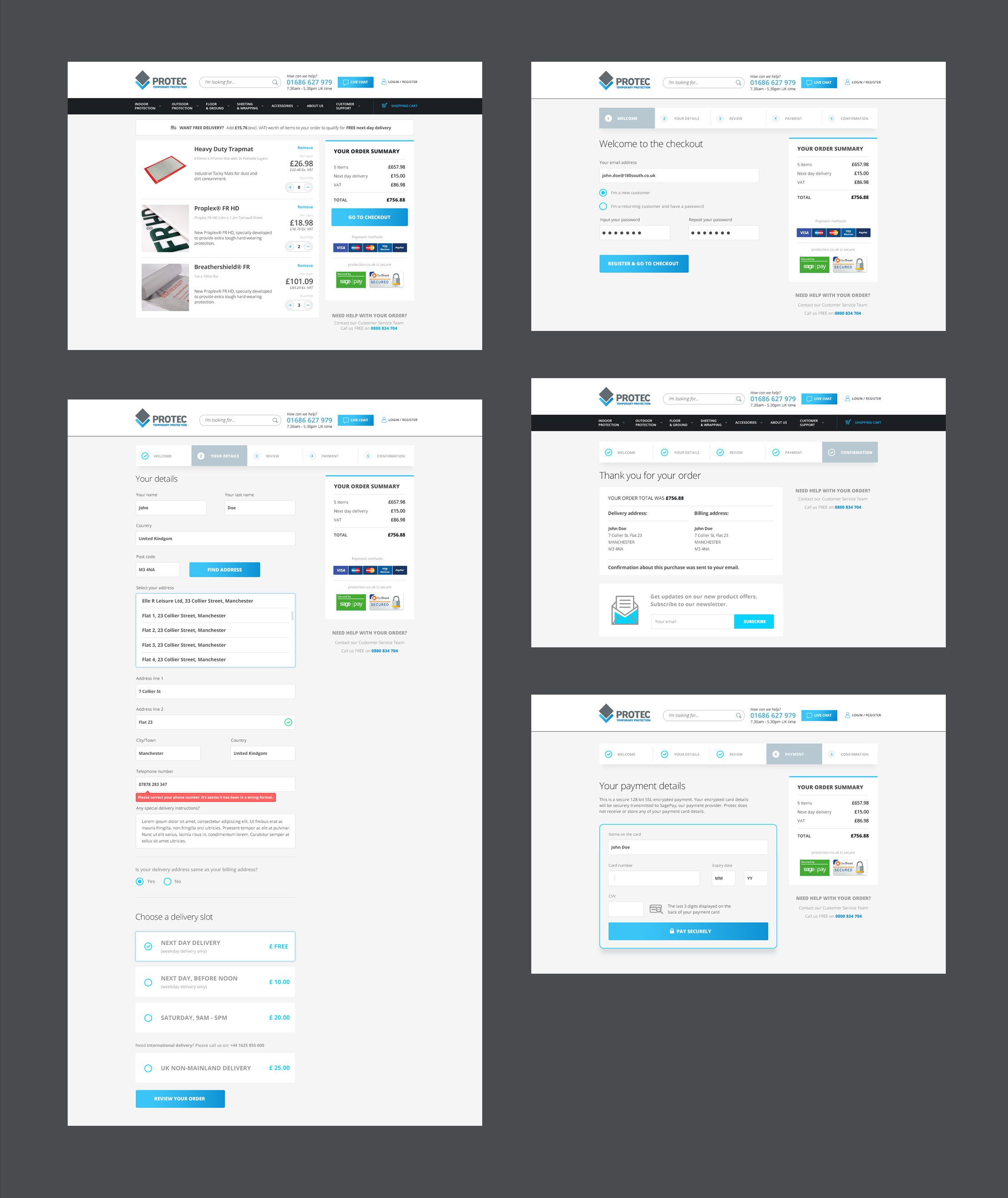
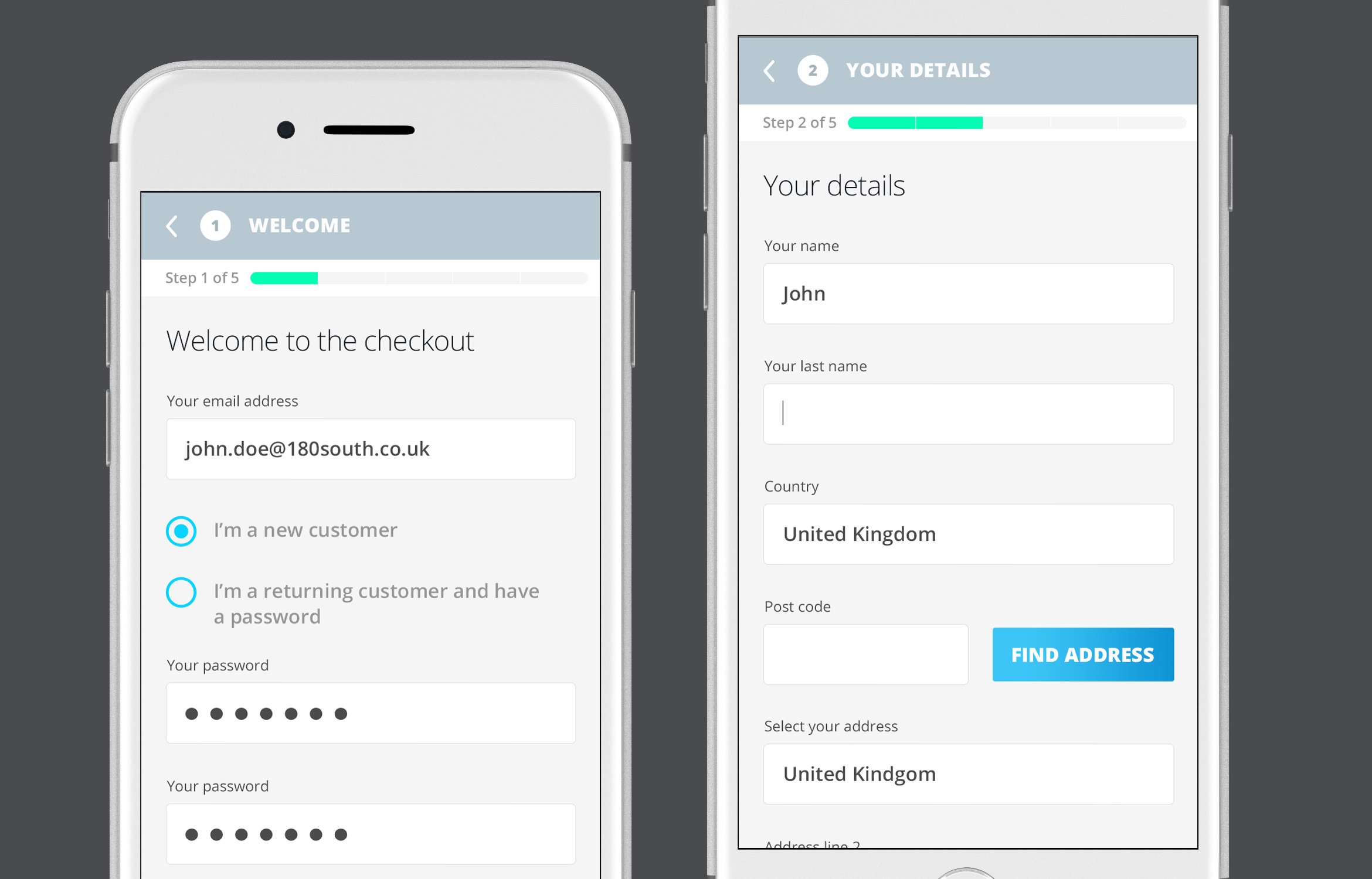
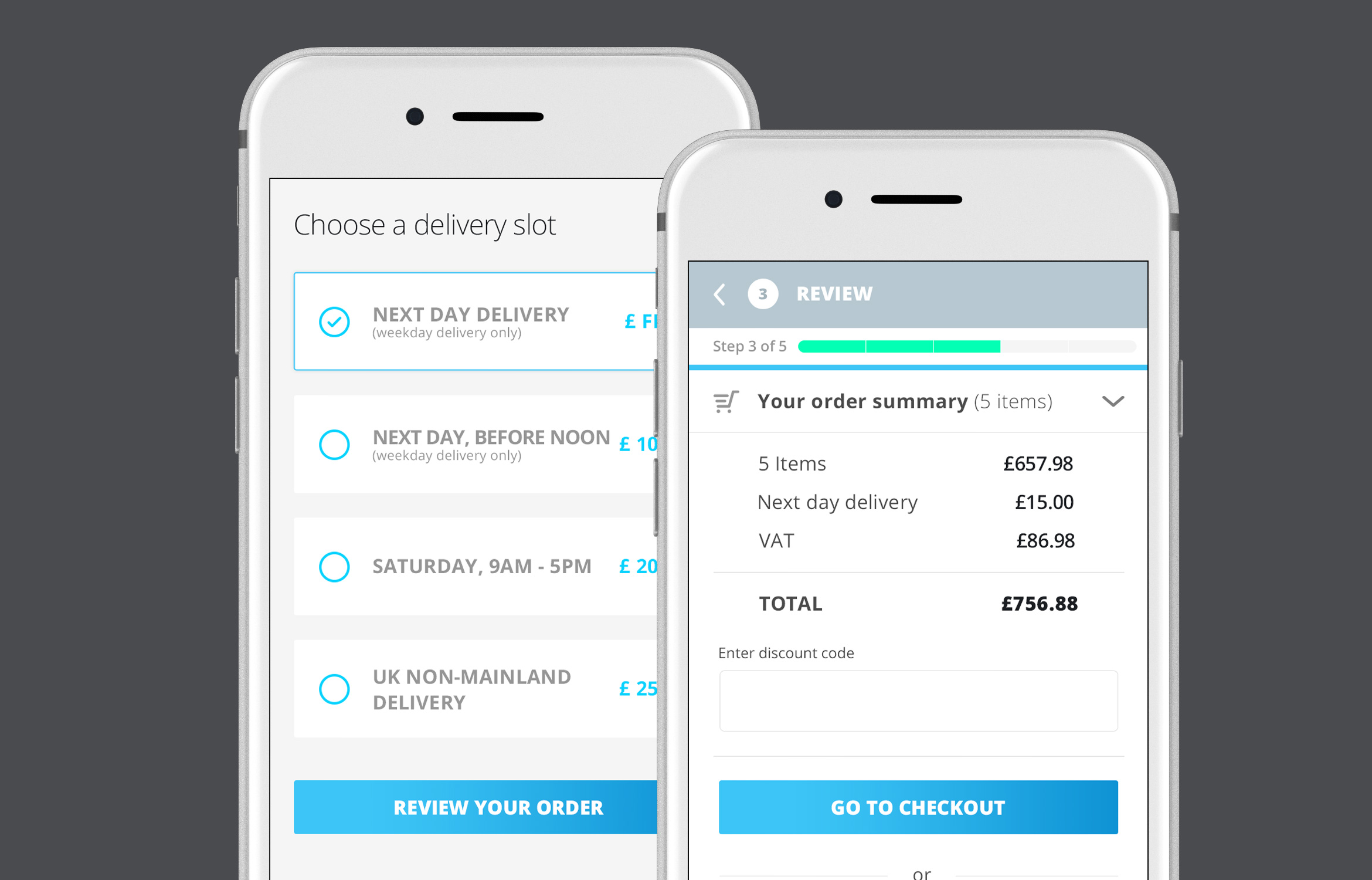
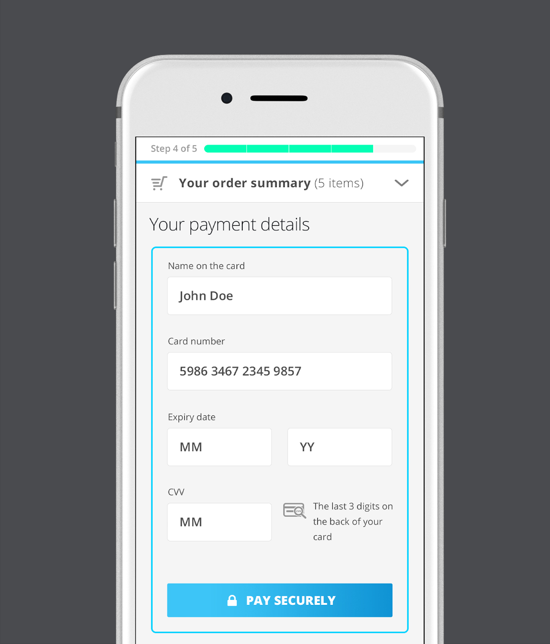
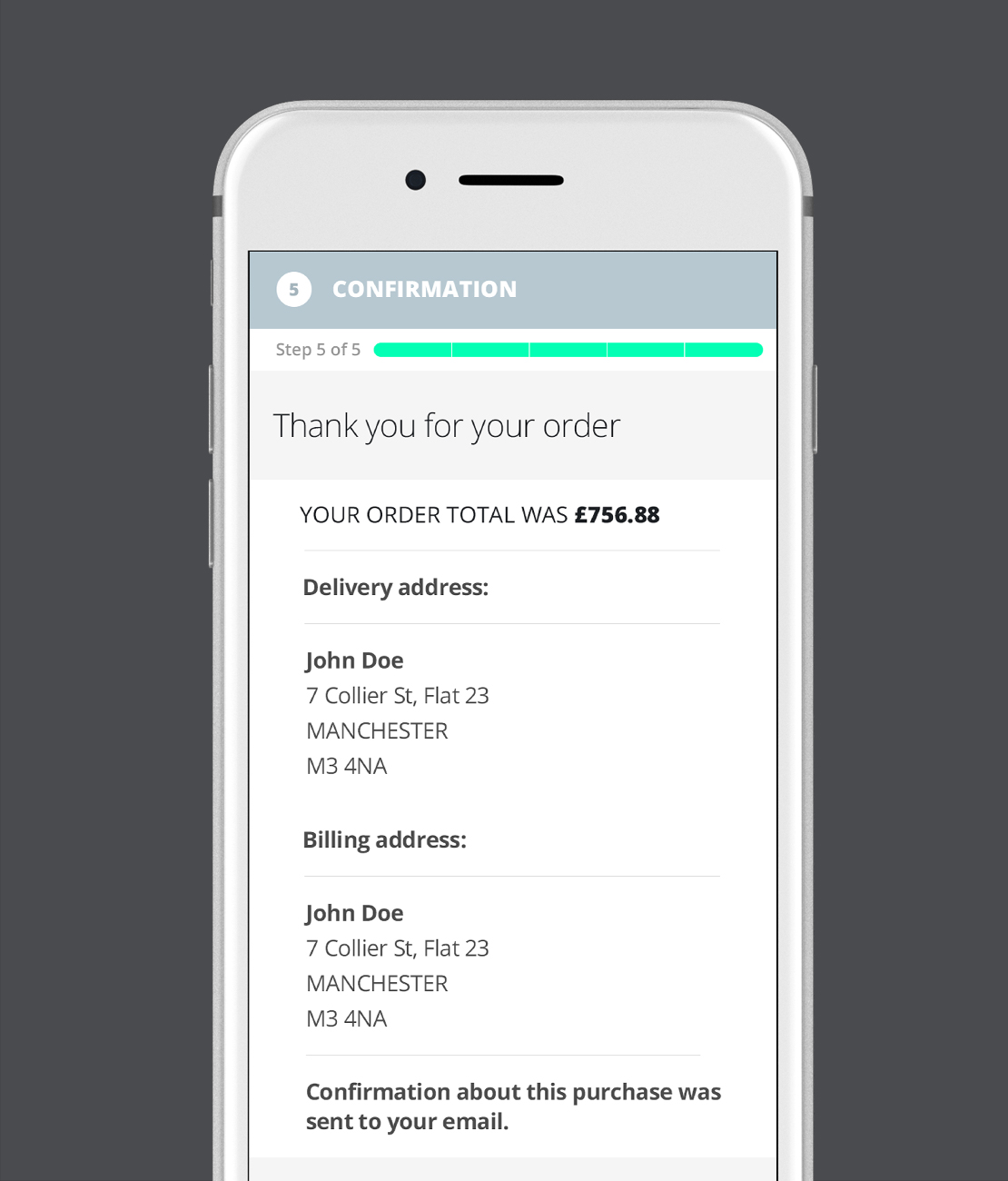
For the online store, the design is more light with the relevant information upfront. The existing online store checkout process was not optimised for speedy checkout and reducing the steps to complete the checkout was a logical decision.
PRODUCT PAGE
PRODUCT PAGE
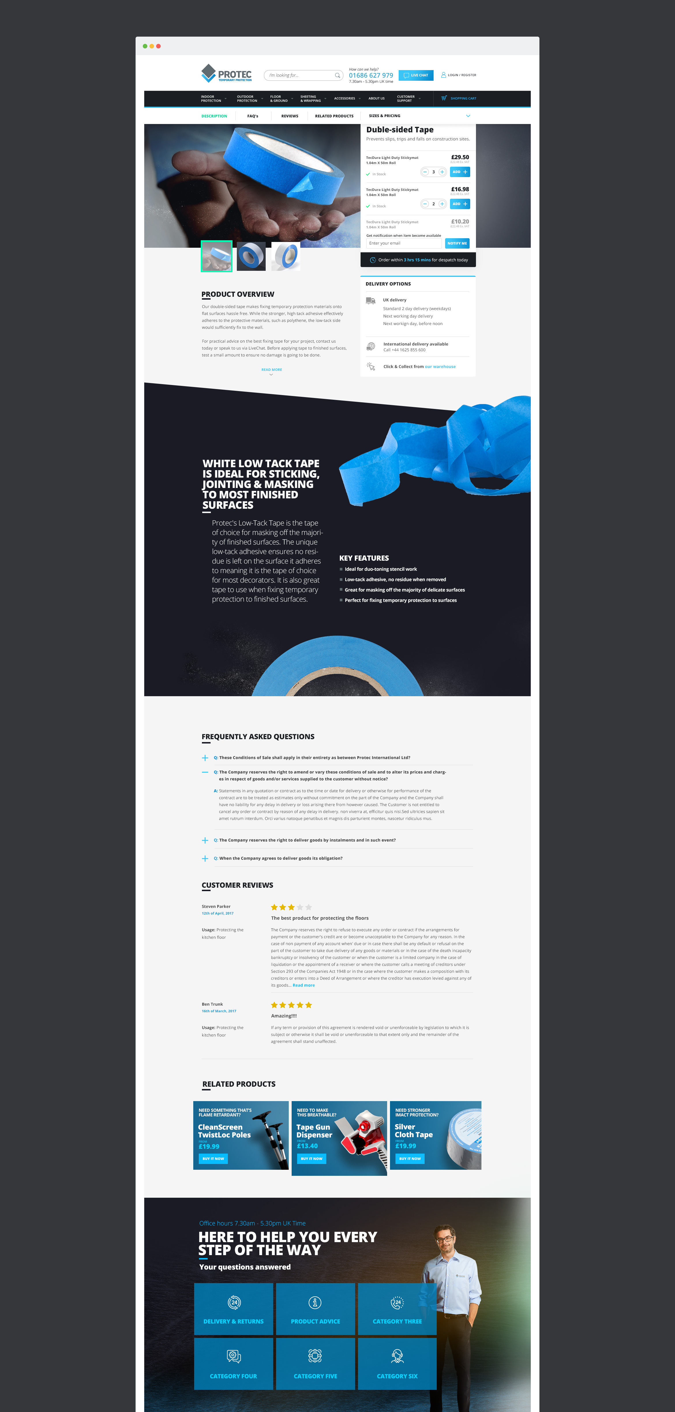
Protec has a line of products which they sell under their brand name. In order to tell users more about those products, I created a page especially for featured products where all the information about each product is presented. Users can also easily see the variations of each product and order those products from this page.
Frequently asked questions and user reviews can be found towards the bottom of the page. With regard to user comments, Protec wanted to see what users think about their products in order to improve them in future releases.
ONLINE STORE
ONLINE STORE
The online store journey was greatly optimised to be faster and and less confusing for the user. The top bar shows the checkout process and the user can easily go back in every step of the journey.

PROTEC BLOG
PROTEC BLOG
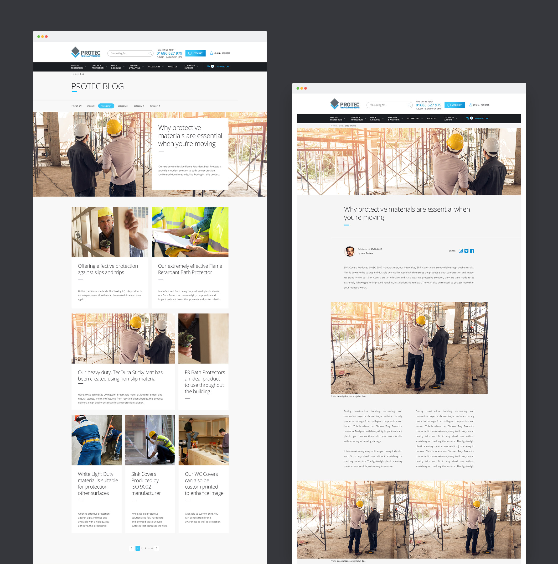
Protec wanted to incorporate a blog feature into their page in order to inform and educate their users about new practices in construction protection and also to announce the release of new products.
Get in touch! info@sabolism.com
